Heilongjiang Qifan Brand Creative Co., Ltd. Xu He
Project Discribe
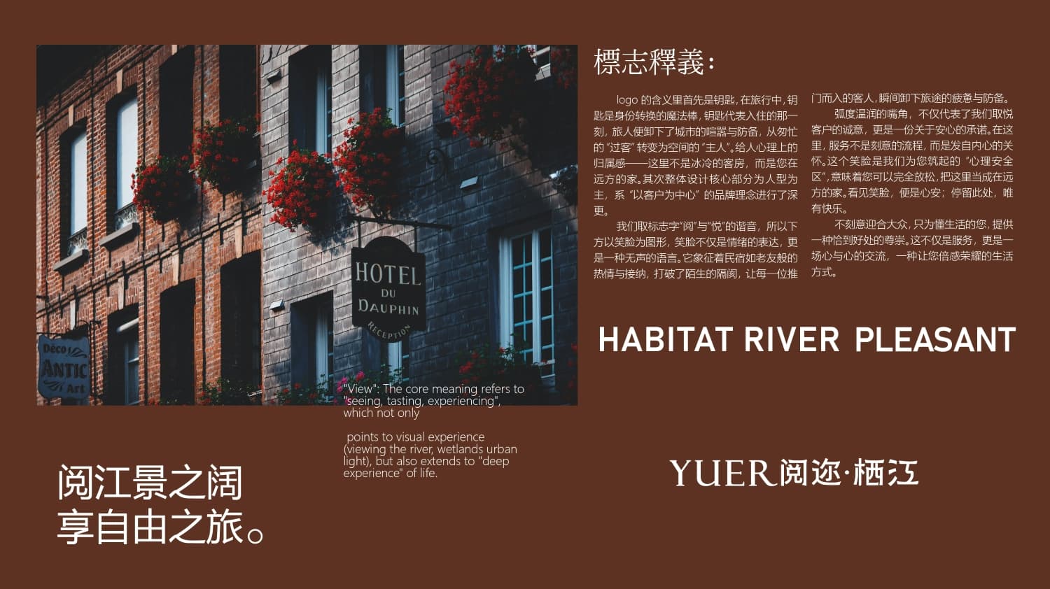
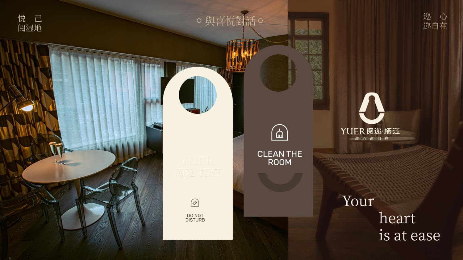
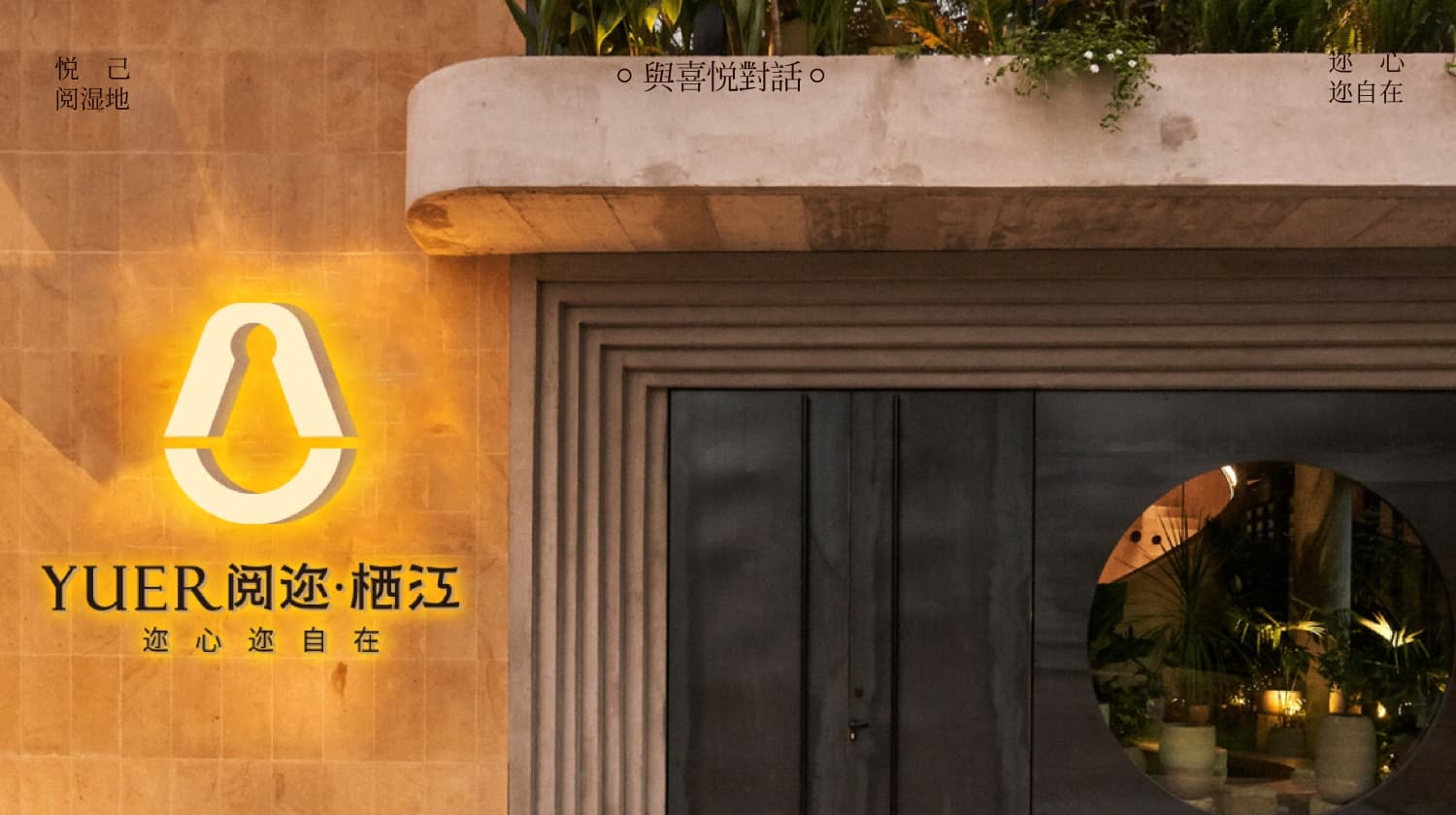
The meaning of the logo starts with a key. In travel, a key is a magic wand for identity transformation. The key represents the moment of check-in, when travelers shed the city's noise and defenses, transitioning from hurried 'passersby' to the 'masters' of the space. It gives a psychological sense of belonging — this is not a cold guest room, but your home away from home. Secondly, the overall design's core part focuses on a human figure, deeply reflecting the brand philosophy of 'customer-centricity.'
We chose the logo characters for their homophony: “阅” (read) and “悦” (joy). Hence, a smiling face is depicted below. The smile is not only an expression of emotion but also a form of silent language. It symbolizes the warmth and acceptance of the guesthouse as an old friend, breaking the barriers of unfamiliarity and allowing every guest who walks through the door to immediately release the fatigue and defenses of their journey.
The rounded curves of the mouth not only represent our sincerity in pleasing customers but also serve as a promise of reassurance. Here, service is not a deliberate process but heartfelt care. This smiling face represents the 'psychological safe zone' we have built for you, meaning you can fully relax and consider this place your home away from home. Seeing the smile brings peace of mind; staying here brings only happiness.
We do not deliberately cater to the masses but provide a sense of appropriate respect for those who understand life. This is not just service but an exchange of hearts, a lifestyle that makes you feel honored.